Removing colour can make a photograph clearer, but it can also remove the information that made it interesting. A red coat against a green wall may separate strongly in colour and merge into similar grey tones. I treat black and white as a different way of organising the picture, not a button that automatically adds atmosphere.
The useful question is what the image gains and loses. That gives you a reason for the conversion beyond disliking the colour version or wanting a set to look more serious.
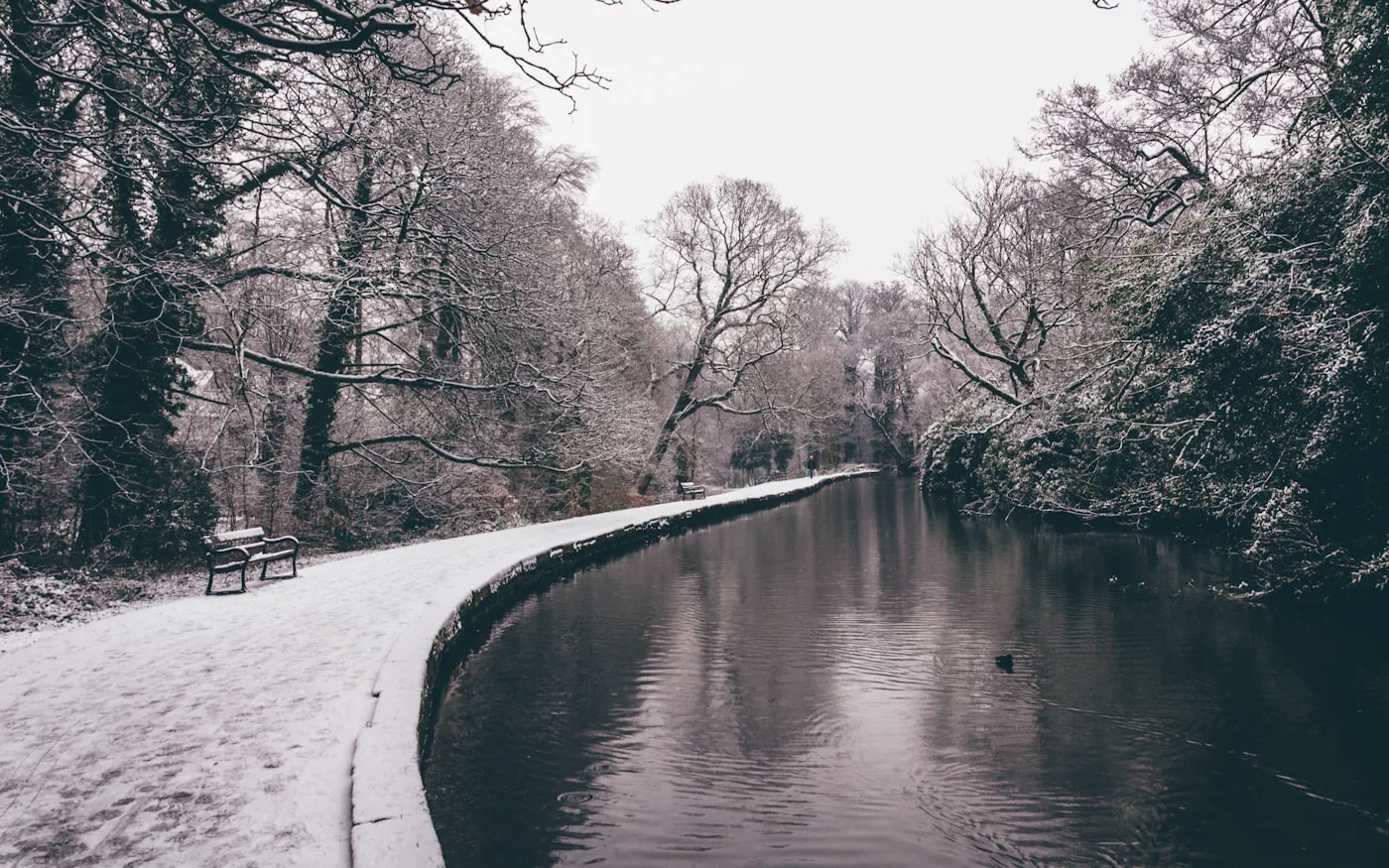
A scene can look almost black and white before any editing. Here, snow and winter light reduce the colour naturally. I would check what colour is present and what it contributes before deciding whether a conversion would improve the picture; a restrained palette alone does not tell you how an image was edited.
Identify what colour is doing
Before converting, name the role of colour in the photograph. It might distinguish the subject from the background, describe an important object or create a relationship between two areas. If the picture depends on one of those things, you will need another way to preserve it.
Colour can also compete with the subject. A bright sign may dominate a quiet expression, while the shapes and light remain more interesting than the sign itself. In that case, monochrome is worth testing. It still needs to be judged as a complete image.
Check separation between neighbouring tones
Look at edges where important objects meet. Does a dark sleeve disappear into a wall? Can you distinguish the shape of a leaf from the background? If different colours turn into similar tones, a global contrast increase may not solve the specific problem.
Where your editing tool allows it, adjust the conversion deliberately and compare the result. Watch for unnatural-looking transitions and damaged detail. The objective is readable relationships, not the greatest possible difference between black and white.
Let texture support the subject
Monochrome can make texture more noticeable, which is useful for stone, leaves, fabric or weathered surfaces. It can also encourage you to push every small detail too hard. I would check whether the main subject still leads the picture once the texture becomes prominent.
Imagine a portrait beside a rough brick wall. A forceful treatment may make the wall more interesting than the person. A gentler background and clear separation around the face may serve the photograph better, even if the result looks less dramatic when viewed in isolation.
Make a fair comparison
Review the colour and monochrome versions at the same size. Give each a reasonable edit rather than comparing a finished conversion with an untouched colour file. Look at the image as a whole before zooming into texture.
Ask what you notice first, what the photograph communicates and whether any useful detail has disappeared. If both versions work for different reasons, keep both as deliberate alternatives. You do not need to prove that one treatment is universally superior.
Consider the whole selection
A single black-and-white image in a colour set can be a useful pause or an unexplained interruption. Decide what it does in the sequence. If you mix treatments, make the choice clear enough that it feels considered rather than like a workaround for one awkward frame.
A simple exercise is to choose three images: one led by colour, one by shape and one by texture. Convert all three and write down what each loses. That review will teach you more than applying the same look to an entire folder. For colour selections, the same judgement applies to keeping an edit consistent without erasing the scene.